Monsters.fun
Role
Product Design Intern
Team
Creative
Duration
Feb-July 2025

Brief
Monsters is a crypto AI game where users can train and trade AI pets.
Check It Out

What I
Delivered
- Research synthesis identifying the core unified insight
- Interactive prototypes demonstrating the unified experience
- Design system with 12 components, interaction specs, and implementation guidelines
- Usability testing insights across 3 rounds with 12 participants
- Developer handoff documentation
The Problem
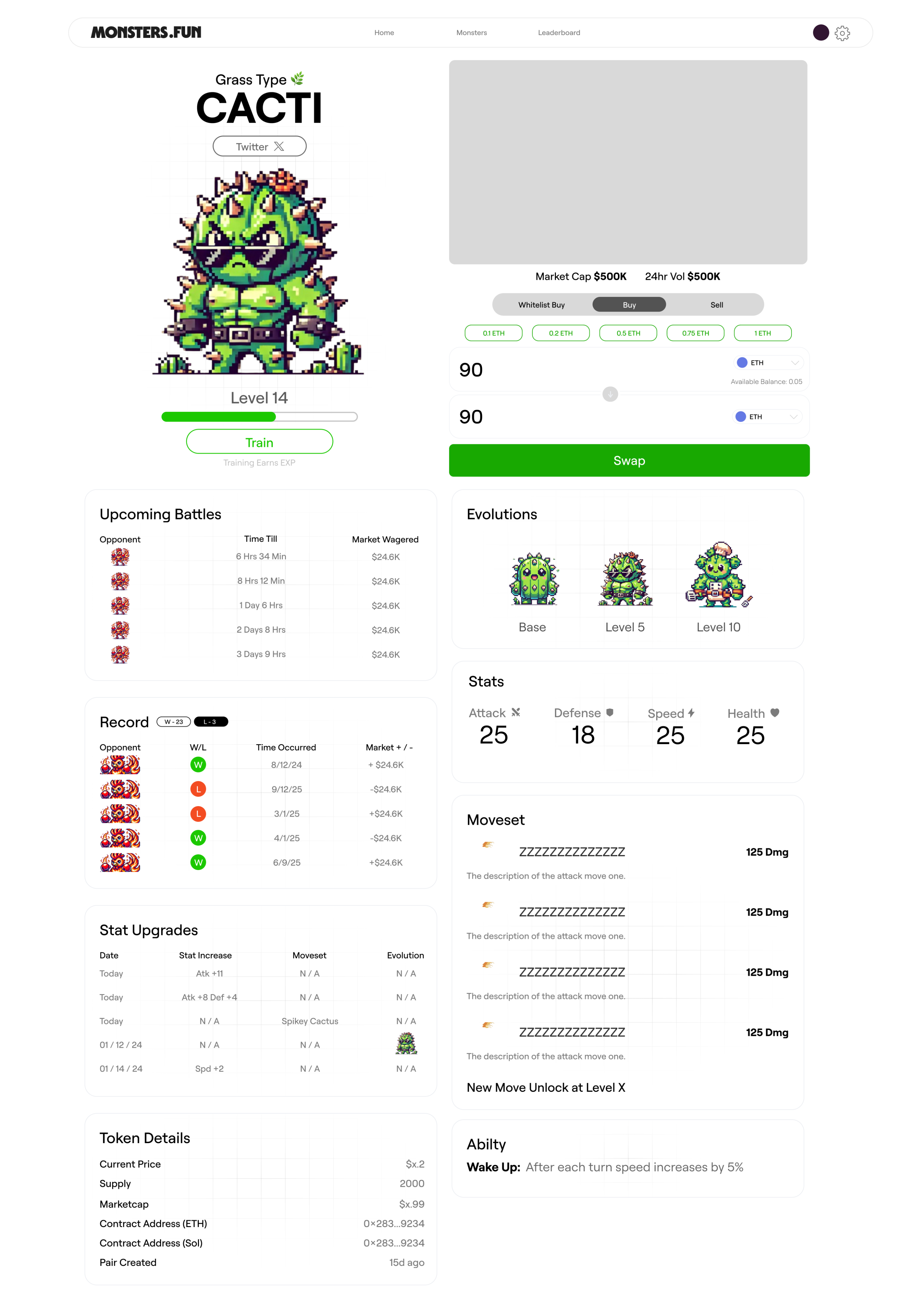
When I joined Monsters.fun, the product felt fractured. Beautiful pixel art game on top, crypto dashboard underneath—two separate apps forced together. Crypto users couldn't connect with the gaming. Gamers felt overwhelmed by DeFi.
The real challenge wasn't simplification—it was creating unity where neither side felt like an afterthought.

User Research Insights
I led 8 user interviews—4 crypto-native, 4 gamers new to blockchain. I expected completely different needs.
Crypto users: "I understand DeFi but this game stuff feels tacked on."
Gamers: "Why do I need a wallet? This doesn't feel like a game."
Both groups were describing the same problem from different angles. This insight became my north star—instead of designing for two audiences, I needed design language that served both simultaneously.
Design Process:Three Key Decisions
Through 3 rounds of testing with 12 participants and MoSCoW prioritization, I helped the team make three design decisions that unified the experience. Each emerged from iteration.
- Spatial Navigation
Users ignored the pixel art town and clicked generic menu buttons instead. I redesigned the information architecture so each building became a section of the app—navigation became exploration. After 15+ wireframe variations, we landed on spatial navigation that mapped blockchain onto familiar mental models from games like Zelda and Pokémon, creating an immersive world where navigation feels connected and actions are immediately clear.
Past iterations: Traditional menus with the world as decoration. User testing showed people ignored it entirely.
Before
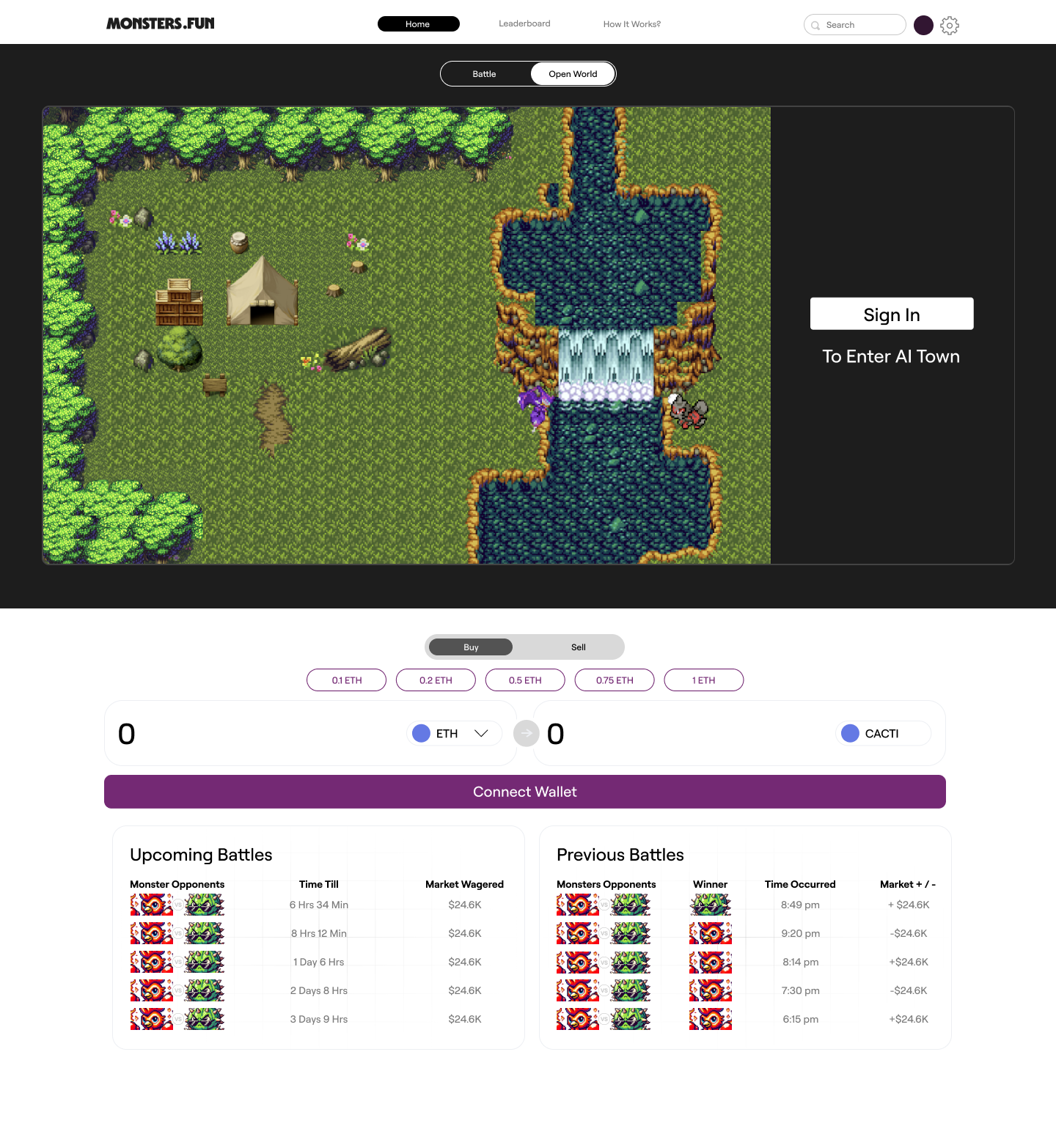
After
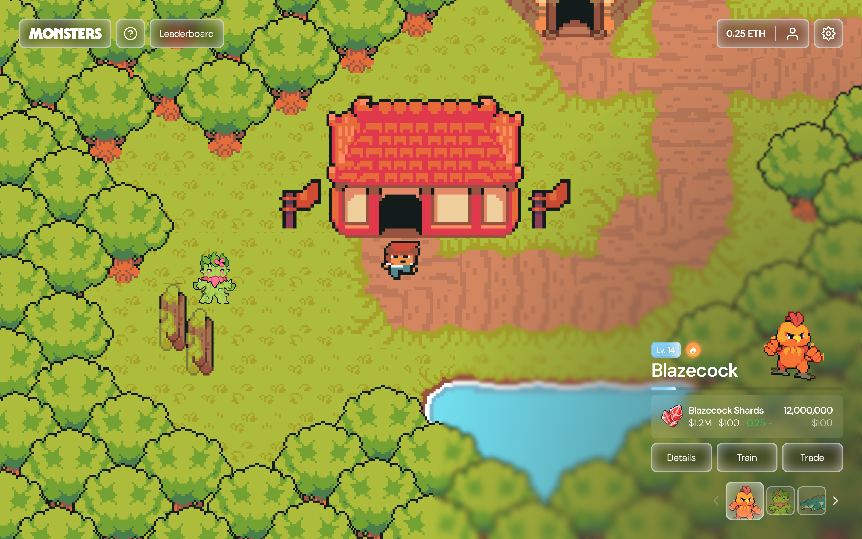
- Liquid Glass Overlays
We needed to display technical crypto data without breaking immersion. Playful overlays felt patronizing to crypto users. Solid panels made gamers feel like they'd left the game.
I adapted Apple's glassmorphism for gaming aesthetic. Working with developers, we tested 5 opacity/blur combinations after my initial spec caused performance issues. The final overlays maintain game world visibility while keeping data readable, integrating profile data into the game environment so financial information became part of the adventure rather than a separate dashboard.
Before
After
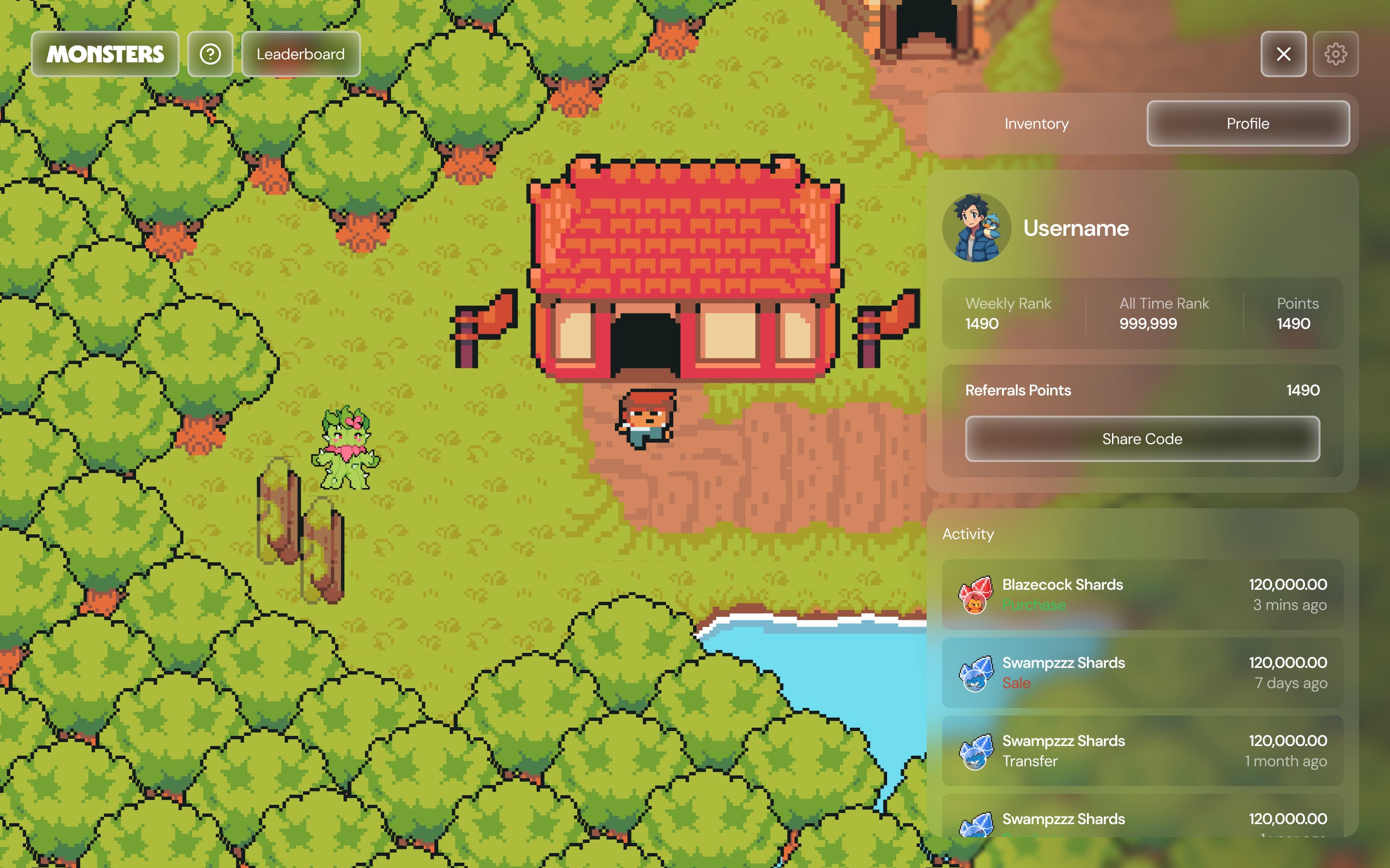
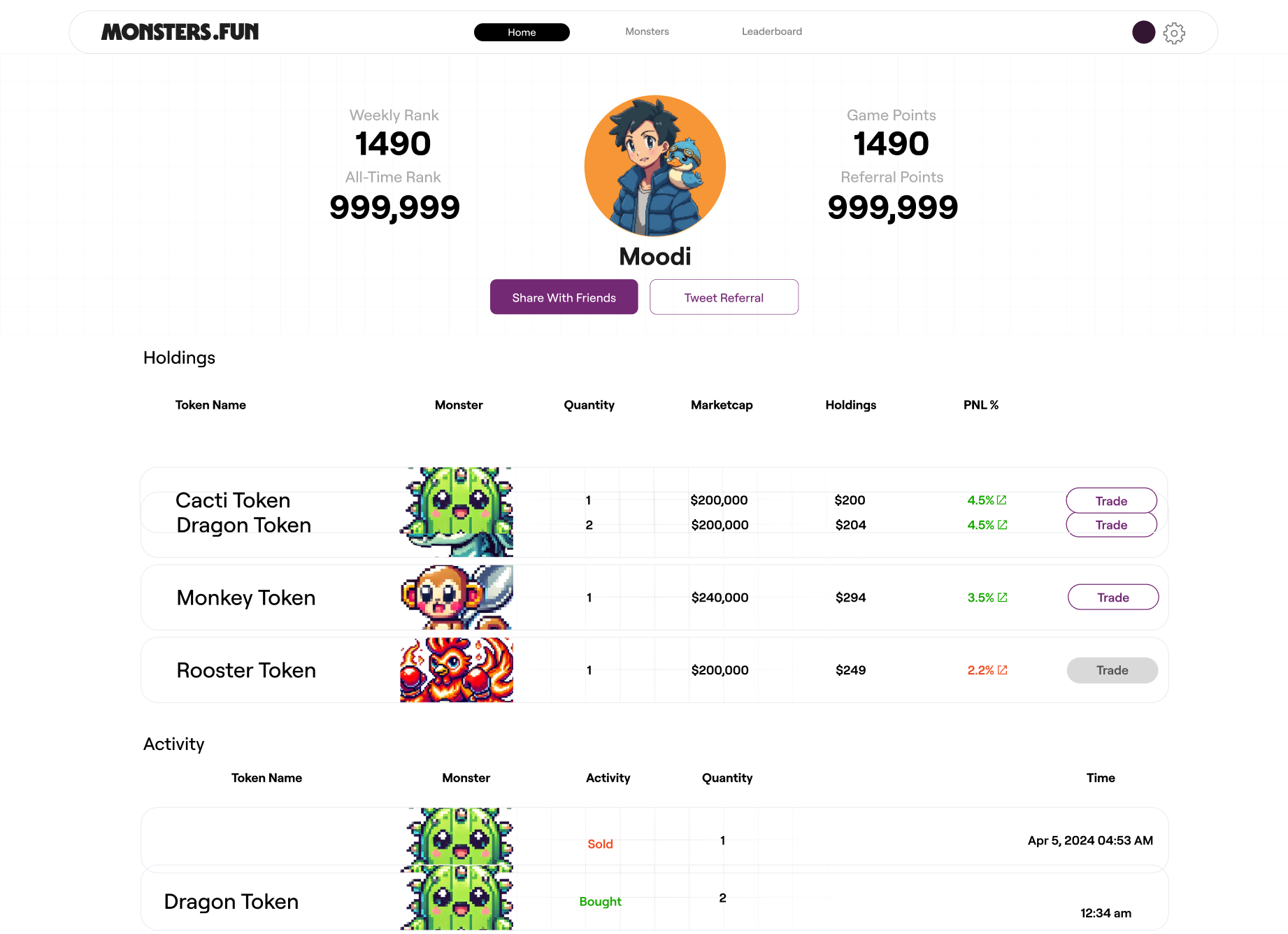
- Progressive Disclosure
We initially hid crypto complexity behind game language. During testing, a crypto beginner said: "I feel like I'm being lied to when apps hide what's really happening. Why won't you just show me?"
Users wanted transparency without overwhelm. I redesigned with two-layer architecture: game language on the surface (Weekly Rank, Game Points) with full crypto details available via "View Details" (ETH amounts, transaction hashes, gas fees). Even users who never accessed the details responded positively—just knowing they could see transparency built trust, and trading felt like gameplay mechanics rather than financial tools.
Before
After
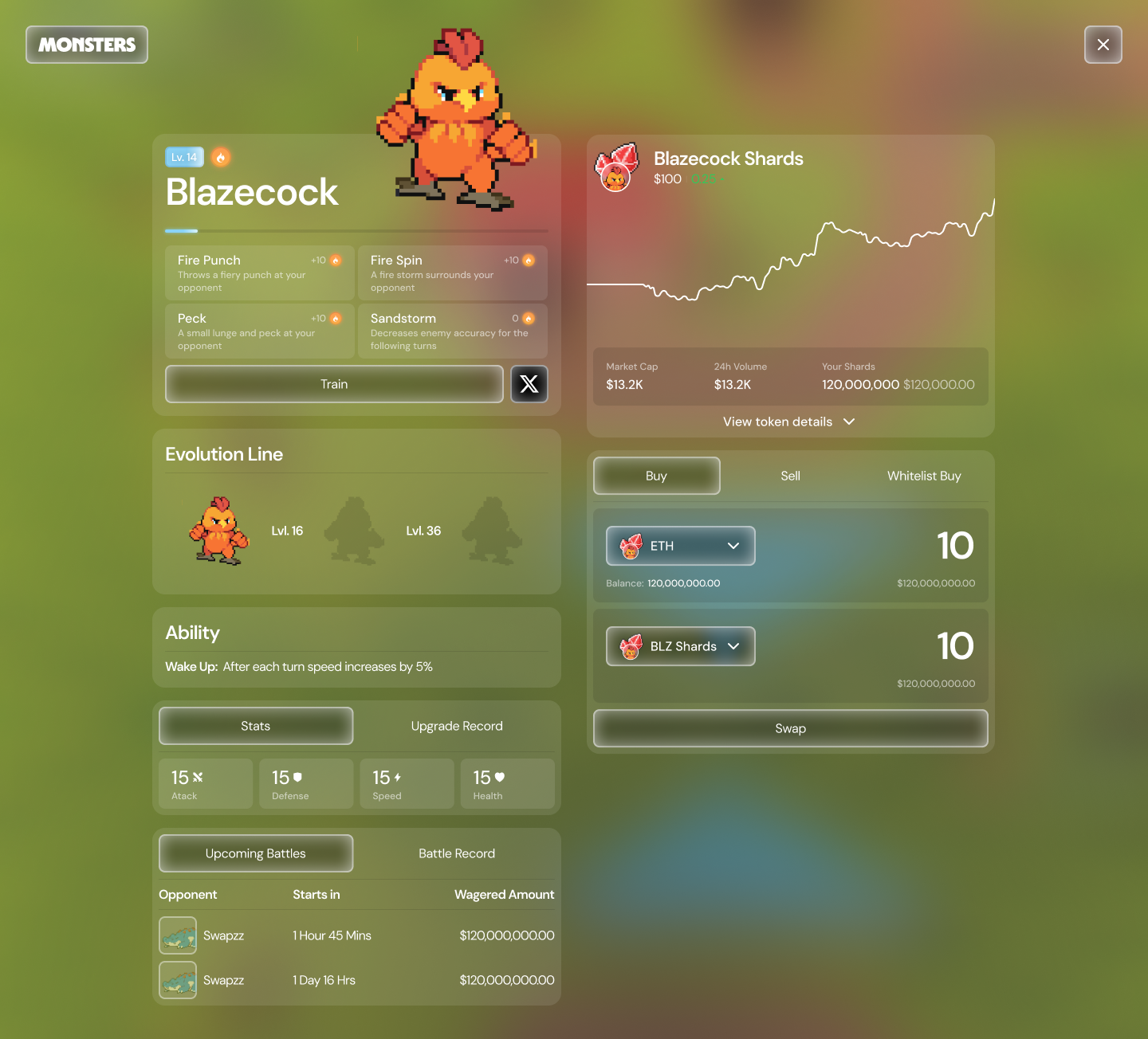
As patterns emerged, I built a design system with 12 components that enabled the team to build future features without breaking the unified experience.
Results &
Learning
Successfully unified gaming and DeFi experiences through consistent visual language validated across 3 testing rounds. The design system I built (12 components with interaction specs) was adopted by the engineering team for future feature development.
Research challenges assumptions: One user quote—"I feel like I'm being lied to when apps hide things"—pivoted our entire approach from hiding complexity to layering transparency. Holding hypotheses loosely makes better design.
Prioritization over features: Using MoSCoW, we deprioritized animations to perfect core unity. Testing proved users valued coherence over completeness. I learned to defend decisions through strategy, not just aesthetics.
Adapt familiar patterns: Borrowing Apple's glassmorphism and Zelda's spatial navigation worked only after adapting them for crypto gaming context. The skill: asking "What do users already trust?" and making it work for new problems.
Cross-functional collaboration: The best solutions emerged through constraints—developers shaped the glass blur value, user feedback drove the two-layer architecture, and PM prioritization focused our scope.
Takeaway
Designing for emerging technology isn't about teaching users new paradigms—it's about translating innovation into familiar experiences. The best interfaces map the unfamiliar onto mental models users already have. This is what "intuitive" actually means: not simple, but familiar.
Monsters.fun
Role
Product Design Intern
Team
Creative
Duration
Feb-July 2025
Brief
Monsters is a crypto AI game where users can train and trade AI pets.
Check It Out

What I
Delivered
- Research synthesis identifying the core unified insight
- Interactive prototypes demonstrating the unified experience
- Design system with 12 components, interaction specs, and implementation guidelines
- Usability testing insights across 3 rounds with 12 participants
- Developer handoff documentation
The Problem
When I joined Monsters.fun, the product felt fractured. Beautiful pixel art game on top, crypto dashboard underneath—two separate apps forced together. Crypto users couldn't connect with the gaming. Gamers felt overwhelmed by DeFi.
The real challenge wasn't simplification—it was creating unity where neither side felt like an afterthought.
User Research Insights
I led 8 user interviews—4 crypto-native, 4 gamers new to blockchain. I expected completely different needs.
Crypto users: "I understand DeFi but this game stuff feels tacked on."
Gamers: "Why do I need a wallet? This doesn't feel like a game."
Both groups were describing the same problem from different angles. This insight became my north star—instead of designing for two audiences, I needed design language that served both simultaneously.
Design Process:Three Key Decisions
Through 3 rounds of testing with 12 participants and MoSCoW prioritization, I helped the team make three design decisions that unified the experience. Each emerged from iteration.
- Spatial Navigation
Users ignored the pixel art town and clicked generic menu buttons instead. I redesigned the information architecture so each building became a section of the app—navigation became exploration. After 15+ wireframe variations, we landed on spatial navigation that mapped blockchain onto familiar mental models from games like Zelda and Pokémon, creating an immersive world where navigation feels connected and actions are immediately clear.
Past iterations: Traditional menus with the world as decoration. User testing showed people ignored it entirely.
Before
After
- Liquid Glass Overlays
We needed to display technical crypto data without breaking immersion. Playful overlays felt patronizing to crypto users. Solid panels made gamers feel like they'd left the game.
I adapted Apple's glassmorphism for gaming aesthetic. Working with developers, we tested 5 opacity/blur combinations after my initial spec caused performance issues. The final overlays maintain game world visibility while keeping data readable, integrating profile data into the game environment so financial information became part of the adventure rather than a separate dashboard.
Before
After
- Progressive Disclosure
We initially hid crypto complexity behind game language. During testing, a crypto beginner said: "I feel like I'm being lied to when apps hide what's really happening. Why won't you just show me?"
Users wanted transparency without overwhelm. I redesigned with two-layer architecture: game language on the surface (Weekly Rank, Game Points) with full crypto details available via "View Details" (ETH amounts, transaction hashes, gas fees). Even users who never accessed the details responded positively—just knowing they could see transparency built trust, and trading felt like gameplay mechanics rather than financial tools.
Before
After
As patterns emerged, I built a design system with 12 components that enabled the team to build future features without breaking the unified experience.
Results &
Learning
Successfully unified gaming and DeFi experiences through consistent visual language validated across 3 testing rounds. The design system I built (12 components with interaction specs) was adopted by the engineering team for future feature development.
Research challenges assumptions: One user quote—"I feel like I'm being lied to when apps hide things"—pivoted our entire approach from hiding complexity to layering transparency. Holding hypotheses loosely makes better design.
Prioritization over features: Using MoSCoW, we deprioritized animations to perfect core unity. Testing proved users valued coherence over completeness. I learned to defend decisions through strategy, not just aesthetics.
Adapt familiar patterns: Borrowing Apple's glassmorphism and Zelda's spatial navigation worked only after adapting them for crypto gaming context. The skill: asking "What do users already trust?" and making it work for new problems.
Cross-functional collaboration: The best solutions emerged through constraints—developers shaped the glass blur value, user feedback drove the two-layer architecture, and PM prioritization focused our scope.
Takeaway
Designing for emerging technology isn't about teaching users new paradigms—it's about translating innovation into familiar experiences. The best interfaces map the unfamiliar onto mental models users already have. This is what "intuitive" actually means: not simple, but familiar.
Monsters.fun
Role
Product Design Intern
Team
Creative
Duration
Feb-July 2025
Brief
Monsters is a crypto AI game where users can train and trade AI pets.
Check It Out

What I Delivered
- Research synthesis identifying the core unified insight
- Interactive prototypes demonstrating the unified experience
- Design system with 12 components, interaction specs, and implementation guidelines
- Usability testing insights across 3 rounds with 12 participants
- Developer handoff documentation
The Problem
When I joined Monsters.fun, the product felt fractured. Beautiful pixel art game on top, crypto dashboard underneath—two separate apps forced together. Crypto users couldn't connect with the gaming. Gamers felt overwhelmed by DeFi.
The real challenge wasn't simplification—it was creating unity where neither side felt like an afterthought.
User Research Insights
I led 8 user interviews—4 crypto-native, 4 gamers new to blockchain. I expected completely different needs.
Crypto users: "I understand DeFi but this game stuff feels tacked on."
Gamers: "Why do I need a wallet? This doesn't feel like a game."
Both groups were describing the same problem from different angles. This insight became my north star—instead of designing for two audiences, I needed design language that served both simultaneously.
Design Process:Three Key Decisions
Through 3 rounds of testing with 12 participants and MoSCoW prioritization, I helped the team make three design decisions that unified the experience. Each emerged from iteration.
- Spatial Navigation
Users ignored the pixel art town and clicked generic menu buttons instead. I redesigned the information architecture so each building became a section of the app—navigation became exploration. After 15+ wireframe variations, we landed on spatial navigation that mapped blockchain onto familiar mental models from games like Zelda and Pokémon, creating an immersive world where navigation feels connected and actions are immediately clear.
Past iterations: Traditional menus with the world as decoration. User testing showed people ignored it entirely.
Before
After
- Liquid Glass Overlays
We needed to display technical crypto data without breaking immersion. Playful overlays felt patronizing to crypto users. Solid panels made gamers feel like they'd left the game.
I adapted Apple's glassmorphism for gaming aesthetic. Working with developers, we tested 5 opacity/blur combinations after my initial spec caused performance issues. The final overlays maintain game world visibility while keeping data readable, integrating profile data into the game environment so financial information became part of the adventure rather than a separate dashboard.
Before
After
- Progressive Disclosure
We initially hid crypto complexity behind game language. During testing, a crypto beginner said: "I feel like I'm being lied to when apps hide what's really happening. Why won't you just show me?"
Users wanted transparency without overwhelm. I redesigned with two-layer architecture: game language on the surface (Weekly Rank, Game Points) with full crypto details available via "View Details" (ETH amounts, transaction hashes, gas fees). Even users who never accessed the details responded positively—just knowing they could see transparency built trust, and trading felt like gameplay mechanics rather than financial tools.
Before
After
As patterns emerged, I built a design system with 12 components that enabled the team to build future features without breaking the unified experience.
Results &
Learning
Successfully unified gaming and DeFi experiences through consistent visual language validated across 3 testing rounds. The design system I built (12 components with interaction specs) was adopted by the engineering team for future feature development.
Research challenges assumptions: One user quote—"I feel like I'm being lied to when apps hide things"—pivoted our entire approach from hiding complexity to layering transparency. Holding hypotheses loosely makes better design.
Prioritization over features: Using MoSCoW, we deprioritized animations to perfect core unity. Testing proved users valued coherence over completeness. I learned to defend decisions through strategy, not just aesthetics.
Adapt familiar patterns: Borrowing Apple's glassmorphism and Zelda's spatial navigation worked only after adapting them for crypto gaming context. The skill: asking "What do users already trust?" and making it work for new problems.
Cross-functional collaboration: The best solutions emerged through constraints—developers shaped the glass blur value, user feedback drove the two-layer architecture, and PM prioritization focused our scope.
Takeaway
Designing for emerging technology isn't about teaching users new paradigms—it's about translating innovation into familiar experiences. The best interfaces map the unfamiliar onto mental models users already have. This is what "intuitive" actually means: not simple, but familiar.